Color Theory is a set of principles that guide the use the colors and color combinations to give a design coherence and visual appeal. Good design software contains some variation of the Color Wheel to help designers pick a specific color. However, much like other tools, this tool can be abused rather quickly if used by a designer without a thorough understanding of how to pick and choose colors that suit their needs. In other words, without a thorough understanding of Color Theory.
Skimming through the Middle School stuff
Primary Colors are the colors that can’t be gotten by combining other colors. They are Red, Yellow and Blue (Some folks will say Red, Green and Blue but honestly, for this article, it doesn’t matter. Plus RGB will be useful later on).
Secondary Colors you get by combining Primary ones. They are Orange, Green and Purple. Tertiary Colors you get by combining Primary and Secondary colors.
People who paint or create art on Physical Mediums appreciate the wheel a lot more than Digital Artists or Designers because things work different on the computer (we’ll get there).
Why the throwback? Well, the knowledge comes in handy once you start trying to garner a knowledge of what colors work well together and we will get to that in a second. But first, some important exposition.
Properties of Colors
If you’ve ever looked at a Color Wheel in any of those good design software I mentioned earlier, you’d see a lot more colors than the ones above, and that’s because the advanced color wheel used in standard design software contains every possible variation of these colors. The variations are gotten by editing three(3) key properties of each color: Hue(Color Identity), Saturation(Tone/Intensity) and Value(Tint and Shade).
Hue: is what makes a color a color, its identity. You see a blue, you know it’s blue.
Saturation: refers to how vibrant a color is, or how dominant its hue is. The more gray is added to a hue, the more desaturated (not vibrant) the resulting color is – this is known as ‘Tone’. Saturation is also known as ‘Intensity’ or ‘Chroma’ (bit more complicated, but that’s for physicists to unpack).
Value: of a color is its relative lightness or darkness (relative to its base hue). A color is made darker by adding black to its base hue, ‘Shade’ refers to how much black is added to a hue. In the same vein, a color is made lighter by adding white to its base hue, ‘Tint’ refers to how much white is added.
What we’ve just outlined is what I like to call the ‘Technical Properties of Colors’. They are all fact, but it’s hard to see how they help you (the genius artist) choose the right colors for your masterpiece. And that brings us to the…
Practical Properties of Colors
There’s two major ones we should consider as they play a big part in determining the mood.
Temperature: Sounds a bit weird, but yes, colors can give an illusion of temperature in a design. More Red, Orange or Yellowish hues give off a ‘hotter’ look while Blue Hues and Green ones give off a ‘cooler’ look. Notice I said hotter/cooler “look”? That’s because there are a lot of ways that you can utilize this perceived temperature in your design. Hotter looks (especially when the overall color tilts to more Red variants) can encourage viewers to have a ‘rush’ mentality. A dark gloomy blue (reminiscent of stormy weather) could give your design a sad or chill atmosphere, which could be helpful in conveying your message.
Emotion: You may have been thought colors and their emotions in elementary, fun class I hope. Either way, it’s true and well-known that as a society, we’ve come to associate certain colors with certain meanings and connotations, and a lot of times, slightly different colors can share quite similar interpretations. Here’s a quick reference list you can skim over:
| Red | Anger, Danger, Passion, Love |
|---|---|
| Orange | Kindness, Warmth, Motivation, Creativity |
| Yellow | Happiness, Activity, Fun, Biohazard |
| Green | Nature, Health, Tranquil Walks |
| Blue | Calm, Sadness, Dependability, Wisdom |
| Pink | Compassion, Love |
| Purple | Wealth, Wisdom, Prosperity, Mystery |
| Brown | Earthiness, Stability, anything that has to do with woodwork. |
| Teal | Discovery, Openness, Collected & Calm |
| Black | Elegance, Death, (also) Danger |
| Gray | Melancholy, Bleakness, Mystery & the Unknown |
| White | Innocence, A Fresh Start |
Color Palettes
The colors you use in a project could depend on one of various factors. It mostly depends on the kind of emotion you want to evoke in a viewer. It could depend on a brand’s colors, which are also most likely a reflection of what emotions they want their consumers to feel when interacting with them – could be Professionalism (often Black and White like suits or a Deep Dark Blue to give feelings of calm or stability) or Satisfaction (a nice Sky Blue), or maybe they want customers to make a quick decision (then a more fierce Red could suffice).
Before a viewer even starts reading the content in your design, the colors you use make them feel a certain way. It’s in your best interest to make sure that feeling serves you well and supports the message you’re trying to convey.
The combination of colors you use in a project is called the Color Palette. The key to a satisfying design is a concise color palette of about 5 colors max. The ways we construct a Color Palette for a project is usually:
- Picking a Base Color. This can be picked based on an emotion you’re trying to convey or the brand’s color.
- Picking colors that complement or go well with the base color. If the base color was picked because it’s a brand color, then the brand usually has a suite of colors to pick from.
- Deciding what roles each of your colors will play in the design.
There are numerous tools that can help with building a good and comprehensive Color Palette. There’s a popular one provided by Adobe, it can help you build a palette with Complementary Colors, a Monochromatic Color Palette and many more using different tested ‘formulas’ of sorts. But there is something I skipped explaining, isn’t there?
Color Roles
Okay, so you’ve chosen the colors that work best for your new project, what next? Well, now you should be ready to define what role each of those colors are going to serve. Different people have different names for it, but I think I’ve broken them in categories that are easy to understand and also best fit the process you are more likely to go through.
Base Color: is the main color, the primary color, the central color… There are a lot of words that come to mind. It’s the most common color found in your design (unless it’s drowned out by the background or if you choose to use more neutral colors like White or Black).
Accent Color(s): is any color different from the base color that is used to emphasize foreground elements. These colors work well when there is good contrast between the Accent and the Base. Remember, Contrast.
Surface/Background Color(s): are colors used for the background(s). Neutral colors and less vibrant colors work quite well for this role.
Variant Color(s): I use this term to refer to all the little guys that don’t really have an umbrella term. The outline colors, the lower-emphasis sections, the more desaturated colors used when a mouse hovers over a button (for the web designers). They can be lighter or darker variations of your Base and Accent colors.
A Case Study of Good Color Usage
I find that things like Color are a lot harder to properly put into words and usually need a more visual component of learning. So , how about we study a few examples of stellar color use in design.
As an example of just how much society and trends influence our interpretation of color, we can look no further than the evolution of Black. Just saying it can evoke thoughts of Death Metal and Grungy Wall Posters, but nowadays there’s a very strong correlation between Black and Elegance. It’s simplicity and surprising strength come together to make it a color that, when used right, demands attention without ‘screaming’ for it. As such it’s been used in Modern Design to present a premium appearance.
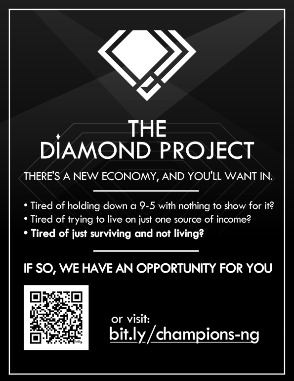
Credit: Yuri Dylan
The flyer below (also by yours truly) brilliantly combines Green’s omnipresent association with Nature and The ‘Activeness’ of yellow to convey its message. It also uses an overall yellow hue overlay to give the design a warmer feel and thus a more outdoors vibe.
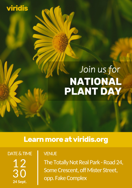
Credit: Yuri Dylan
McDonald’s is a pretty popular brand – and that may be the understatement of the year. So, it’s no surprise that the brand colors they use are carefully selected. It’s also no surprise that everyone who does even a little bit of digging can tell why they chose the iconic Red & Yellow… but to save you the Google search: Red lights a flare in our minds, it inspires energy, a ‘rush’ like I’ve mentioned – and in the case of McDonald’s, that rush translates to appetite. No jokes, red can make you hungrier. Pair that with a friendly yellow that goes hand-in-hand with the McDonald’s brand’s family friendly appeal (one of the reasons for their name change to just “McDonald’s”), and we have a winner.
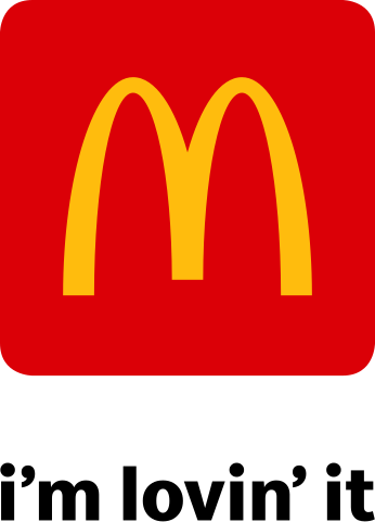
Credit: McDonald's
Another equally recognizable brand is IKEA. On their use of colors, IKEA state themselves that the Blue creates attention to the offer while the ever-friendly yellow is “an optimistic color giving customers a positive impression when meeting the IKEA brand”. This makes perfect sense as Blue is a rather calm color that has been shown to enhance focus and reduce stress, thus indeed creating attention to the offer and having the added benefit of making customers relax in this Furniture Shop. And, as a cherry on top, the colors fit the founder’s Swedish heritage.
Credit: IKEA
Speaking of the founder, a quick aside – Something interesting I read on the IKEA site was the origin of IKEA’s first ever logo, a Red Circular Logo that the founder liked because it represented low prices. It indeed resembled the spiky circle that screamed the discount at you… minus the spikes. Still, it’s a subtle correlation.
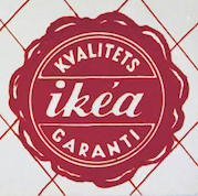
Credit: IKEA
And now it’s (red) curtains!
I hope you’ve gained a somewhat comprehensive knowledge of how colors impact all that we do, especially in design. The key to mastery is, as always, studying good work, working yourself and experimenting. A great direction you could take is researching the ideology behind mighty brands like McDonald’s, IKEA, AirBnb, Apple, Microsoft, Spotify, Dunkin’ Donuts, LEGO, and so much more – I definitely had a lot of fun doing so for this article. Until next time, Innovator!