Graphics Design is a broad field and it comprises a lot of aspects (see what I did there?) like Logo Design, Brand Identity Design, Infographics, Marketing and Advertising Design and much more. The end goal of good graphic design is not just to create something that looks good, but something that passes information to viewers without outright “saying it”. I may not tell you “Rock Hard Gym is a hardcore gym and you’d be feeling the heat every second of your intense journey to becoming an absolute tank!”, I’d hope that’s how you feel when you see the promotional flyer.
Every design is made up of small components, elements if you will. Every element, once they get into your design, carries visual weight. These are the basic elements that designers bring together in a graphic. These are the building blocks, and when put together in perfect harmony, they are how we speak without words.
The Elements
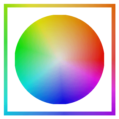
Color: is... well... color. If you can read this, and operate the device on which you are reading this, then I believe that you need no introduction to the concept of colors. I would not waste our time on such a definition, instead I'll tell you what you need to know. (1) Every color communicates a mood. (2) Designers have to be very careful to use colors that work well together in their designs. (3) Once the colors are synchronized, the designer must ensure that they use colors in the right proportion.
Shapes: Like with colors, shapes usually need no explanation as well. Again, something you need to know or may not realize, any bound area can be a shape. In addition to squares, squircles, circles, triangles, designers use various experimental shapes in their designs. Multi-sided polygons and blobs can be found in many new designs.
Text: is… what you’re reading, beloved.
Photos: Pictures are common in modern designs. They are often used as background images. There are various transformations and editing tricks used to make other parts of the such as the text (mostly the text) more legible like blurring the image or overlaying it with a solid color and reducing the opacity of the color-fill layer.
Space: Finally, this is one a lot of people don't realize or just think about, but Space (often called "White-space") is a very important element to balance in designs. Furthermore, in almost every design, there must be a fair amount of space. You don't want to choke your design or stuff unnecessary information in every corner of it, nor do you want to layout necessary information in a wrong way or make it unreadable. As such, it's important that you consider space throughout your design process.
The Pillars
These are the guiding or supporting principles that a designer looks out for while putting the components together to ensure that the finished product doesn’t assault the eyes of viewers. While designers ultimately set themselves apart by their own creativity, we must still respect these rules and allow them to guide our wild imagination. We must allow them to ground us and give us direction.
Balance: To understand Balance in Design, we first need to understand Visual Weight. Every element in design carries Visual Weight, and the heavier an element is, the more prominent it is and the more likely it is to grab a viewer’s attention first. Increasing the size of an element is (literally) the biggest way to increase that element’s Visual Weight and also the most common way. It’s not the only way though, there are other factors that assist in making design elements stand out like Contrast and Placement.
Everything in design, and indeed in most things in life, should be balanced. In our field, this means that we must equally distribute Visual Weight across the page. We should also balance the amount of real content with the amount of white-space on a page so as to avoid suffocating your work.
Composition: is a slightly complex thing, so let's break it down. It's basically the arrangement/layout of your content (the components of your design discussed above). If everything isn't laid out in a consistent manner, viewers of your design may find it frustrating or downright impossible to understand the message you're trying to convey with your design. An important aspect of good composition is the use of Proximity. Proximity is how close two elements are to each other, related stuff are closer together and grouped in some sort of way while separate components have some space between them – closely knit components pull each other together and lightly push other components/groups away.
Most design tools today help you with achieving good composition. A common way that’s done is with Grids. They're other little things that help your layout/composition like alignment and contrast. Alignment is simply making sure that elements align in some way, could be aligned to the left, right or center. We'll get into Contrast right now.
Emphasis: There are mainly three ways to emphasize any given element. Size, Placement and Contrast. Size is pretty obvious, bigger and bolder stuff tends to grab our attention first. Depending on how you use sizing, you can even reverse the normal reading order of viewers (top-to-bottom & left-to-right) and still draw their attention to the big thing first.
On the flip side, you may depend less on increasing size if you give an element priority placement. Under normal circumstances, the whole page has this top-to-bottom hierarchy. All else being equal (i.e. elements at the bottom aren’t super big), viewers are more likely to see what put at the top first. You can amplify the effect by centering the element.
We’ll talk about contrast in a bit, but it’s important to note that you do not want to emphasize too many things at once. You want a focal point, usually a "Call To Action", it’s the thing that’s meant to grab a viewer’s attention first, you may emphasize one or (at most) two other thing(s), but there needs to be hierarchy – Main Focal Point is the strongest attention grabber, Sub Point 2 is what you guide your viewer’s attention to next, then followed by Sub Point 3 (if there is one).
Contrast: refers to how much two elements differ. High contrast between two elements is used to make one of them stand out to viewers so that it catches their attention first.


A great way to test if you have good contrast in a design is to convert to whole thing to grayscale. It's the age old trick!


Typography: is a technique that involves utilizing text as a visual element to not only make your work more appealing to viewer’s, but also help you better send a particular message. It’s a technique you develop overtime and it’s a technique we talk about in far more detail here.
Rhythm & Harmony: Seems like weird words to use here, let me explain. Through out your design, there are unspoken rules you follow in your composition of elements and color usage. For instance, the use of a color palette supports keeping a consistent rhythm in your design. Maybe, every headline is green and in Montserrat, you wouldn’t suddenly switch things up and make another red and in Helvetica (unless you really, really know what you’re doing).
Two or more elements or pages working in Harmony may not always entail identical looks, it’s more related and supporting looks. This quality of looking different yet related is something you build intuition for through practice.
The Long Run
When it comes to design, memorizing can only take you so far. You learn primarily by doing and by looking. Practice, make mock designs – flyers, book covers, posters, business cards – and compare your work to some of your favorite designers. Study and find out what makes their work attractive, and what you may be doing wrong. In all you do, start to look out for these concepts, and you’ll surely be on the road to success.